Handford Plumbing
Branding | Logo | Business cards | Vehicle decal mock-ups
The branding for Handford Plumbing Services is clean, modern, and professional vibe, with a strong, trustworthy feel.
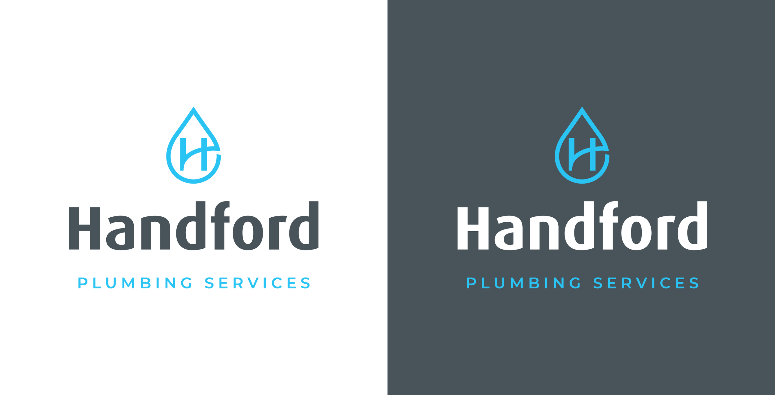
The water droplet shape communicates plumbing and water-related services. The use of a stylised H that connects across the droplet suggests flow, pipes, or connectivity.
The blue tones of the colour palette reflects water, trust, and professionalism with the dark grey providing a strong contrast and a modern edge.
This branding works across light and dark backgrounds, scalable symbol, and simple enough for vehicles, uniforms, and business cards.


